Default
A clean player for resource pages, articles, guides, and normal website content.

Audio should feel like part of the page, not a bolted-on widget. These examples use real Auripath embeds so you can compare how different player styles sit inside normal website content.
Watch how a PDF becomes an embedded audio experience with player, capture, and analytics.
These are real embedded players from Auripath. Use them to compare the presentation, not as separate recommendations for every site.
A clean player for resource pages, articles, guides, and normal website content.
A stronger player for product pages, launch pages, or high-contrast brand sections.
A warmer option for advisory, education, coaching, and human-led services.
A simpler version when artwork would distract from the surrounding page content.
A more functional layout for documentation, portals, and practical resources.
A deliberate high-contrast treatment for experimental, creator, or campaign pages.
For valuable reports, buyer guides, checklists, and webinar follow-ups, the player can ask for an email before playback, after a preview, or not at all.
A simple email gate before the full audio version.
A stronger gated treatment for campaign or launch pages.
A softer lead capture style for warmer education or advisory content.
A focused capture treatment when cover artwork is not needed.
A practical capture layout for documentation, portals, and resources.
A lighter branded treatment for guides, templates, onboarding, and learning content.
Some pages need transcript access, a resource-heavy layout, or a reduced interface. Most pages should stay simple.
Useful when the visitor may want to read, download, and listen from one place.
For pages that need more supporting actions around the audio version.
A more expressive treatment when audio is the main feature of the page.
A stripped-back option for pages where the surrounding copy does the work.
Reduces supporting actions and chrome for a tighter embedded look.
A compact option when the page already explains the resource clearly.
The best player is usually the one that feels native to the page, keeps the visitor focused, and makes the audio option obvious without distracting from the resource.

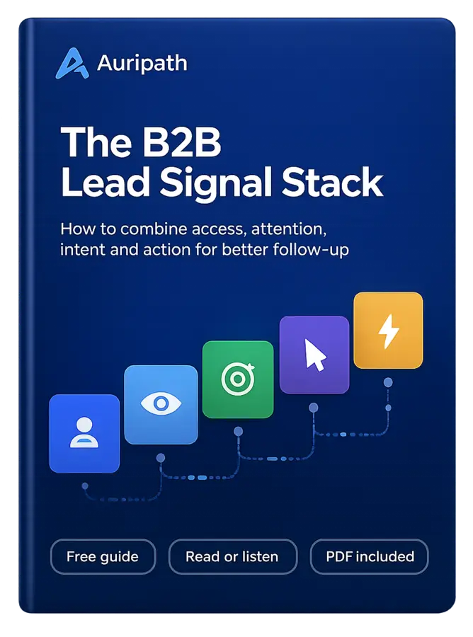
Learn how to turn PDF downloads, listening behavior, and CTA clicks into stronger sales conversations.
🎧 Listened 74%
↗ CTA clicked ✓
● Lead captured ✓
Free B2B guide
Learn how B2B teams can combine PDF downloads, content engagement, CTA clicks, website behavior and CRM context to prioritize better follow-up.